Spatial Vectors in Videogame Design: Part IV
You know the drill: if you’ve landed here first, you’ll likely want to read Part I (at least), Part II, and Part III.
We’re continuing our analysis of spatial vectors in opening screens of NES videogames with four more titles dated between 1987 and 1990. The first is the ‘sequel’ to Super Mario Bros.
Super Mario Bros. 2
Genre: Platformer
Release Date: July ’87 (FDS) / Oct. ’88 (NES)
Carrier: Center, near top of screen
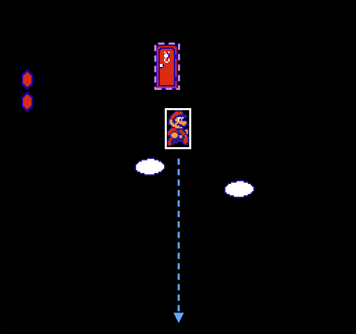
Carrier vector(s): Down (strong)
Beacon(s): Door (deferred)
Threat vector(s): ‘Pit’ (false)
As most Nintendo fans/historians now realize, Super Mario Bros. 2 is the black sheep of the series because it was not the true sequel to the original, but a re-skinned/re-worked version of a Famicom Disk System game called Yume Kojo: Doki Doki Panic. The Japanese Super Mario Bros. 2 was a more challenging version of the original with tweaked graphic tiles, new levels, and a number of interesting new mechanics (e.g., wind, harmful power-ups, gameplay differences between Mario and Luigi, warps backwards, etc.). The Famicom version did not appear stateside until it was revamped for the SNES as a part of Super Mario All-Stars. (And in a peculiar twist, the U.S. version was later ported back to the Famicom as Super Mario USA).
The difference in gameplay between SMB and SMB2 is drastic: the screen scrolls horizontally and vertically; there are four playable characters with varying jump heights and pulling strengths; enemies can be ridden and thrown rather than hopped upon; health can be upgraded; players start in their taller (powered-up) state; and the enemies and setting reflect the Arabian Nights-flavored influence of Yume Kojo. Mario and crew have entered a dreamworld called Subcon, a setting at times more surreal than the Mushroom Kingdom. It’s a weird game, but also a great one.
To introduce the sequel’s total disavowal of SMB’s conventions, players are literally dropped into Subcon from a great height. The carrier (here Mario) emerges from a red door floating in space. Gravity serves as the strong carrier vector—though the player may press left or right as Mario falls, there is no way to escape the descent (and crossing the horizontal border simply wraps to the opposite side). Consider how this introduction reads to the player who has only played Donkey Kong or Super Mario Bros.: in the former, falls beyond a certain height kill Jumpman instantly; in the latter, falling into a void is equally deadly. So Mario plummets into a black void marked only by two egg-shaped clouds, his health lozenges, and that damn red door that is impossible to return to. Thus the threat vector is that looming pit into which you are inescapably cast.
Thankfully, the threat is a red herring meant to introduce the carrier’s ability to scroll the game vertically, and if the player chooses to accept the fall without directing Mario’s descent, she finds that Mario lands safely on a narrow green terrace.
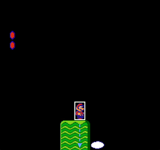
The player harrowingly learns that the carrier can fall from any height without damage. In fact, if they scramble to press Mario left or right while falling and end up missing the first terrace, they’ll still land safely on the third screen, where they find the first impossible beacon (the upper red door) mirrored below, resting safely on the ground. If, on the other hand, the player lands on the high terrace, the next leap of faith is not so daunting, since she knows the fall will not harm her.
This opening setup is a smart reversal of SMB’s: instead of a stretch of runway beckoning the player to sprint right along a horizontal vector, there is a gaping spatial void forcibly pulling Mario to ground along a vertical vector.
Mega Man
Genre: Platformer / Shooter
Release Date: Dec. ’87 (FC/NES)
Carrier: Slightly below center, facing right
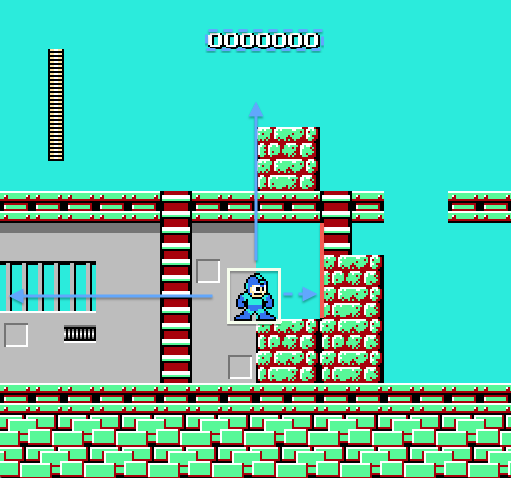
Carrier vector(s): Right (weak), left (strong), up (strong)
Beacon(s): None
Threat vector(s): None
Mega Man has no definitive opening screen since the player can choose to tackle the robot masters in any order. However, Cutman is the likely first choice since this is where the cursor naturally falls after pressing Start (and Cutman’s weapon ends up being a good first choice for further progression).
Cutman’s opening screen is interesting because it immediately blocks Mega Man’s progress. Though the carrier faces right and the short ladder is tantalizingly exposed by a 16-pixel passage, Mega Man cannot squeeze through. The stronger vector is left, but here too the carrier faces an invisible barrier (cleverly abutted by a cell-like barred window) signaling that the convention of scrolling right is still in play. But to do so, the carrier must follow the vertical vector along the ladder, whose burnt umber palette reads well against the grey metallic ‘cell.’
Once Mega Man ascends the ladder, the player can now jump the barrier block (plausibly displaced from the three identical blocks below). With the right vector now unimpeded, the rightmost ladder’s vestigial function is exposed, since descending it leads to the same impassible gap.
The elegance of Mega Man’s modular design is that visiting this stage after Gutsman’s completely reconfigures the vector arrangement.
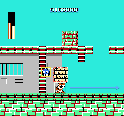
Equipped with the Gutsman power-up, Mega Man can now lift the brick blocks. Pressing him against the barrier triggers the block’s palette change from lime/umber to cream/black, indicating that the block may be lifted. Clearing the blocks creates an unimpeded vector to the right, and what was once a barrier is now a weapon.
Final Fantasy
Genre: RPG
Release Date: Dec. ’87 (FC) / July ’90 (NES)
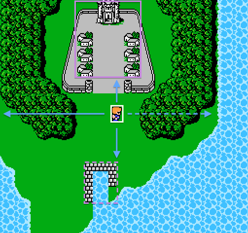
Carrier: Left of center, facing right
Carrier vector(s): Up (strong), right (weak), down (strong), left (strong)
Beacon(s): Town (strong), port (weak)
Threat vector(s): None
Final Fantasy borrows much of its overworld structure from Dragon Quest, but opts not to present the player’s ultimate goal from the opening screen. Instead, the design offers the carrier four possible vectors of varying strength. I label the right vector ‘weak’ because of the hard shoreline barrier. To the left, the border is more ambiguous—it is likely the shoreline continues upward, forming a peninsula, but until the player moves, its true shape is concealed. The downward vector is strong due to the beacon below, but players will likely recognize the structure as a port and quickly surmise that they have no vessel for sailing. Nonetheless, this is an aspirational vector that promises future seafaring—a mode of travel absent in Dragon Quest.
The strongest vector is north since the landscape is dominated by Coneria Castle and its surrounding township. Coneria is an unmissable beacon: the shape of its city walls, mirrored in triplicate by the shape of the surrounding woods, peninsula, and port, compels the player to enter.
Teenage Mutant Ninja Turtles
Genre: Action platformer
Release Date: Dec. ’90 (FC) / June ’89 (NES)
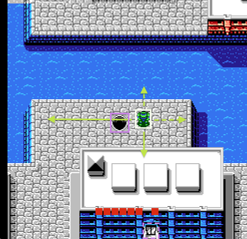
Carrier: Right of center, facing down
Carrier vector(s): Left (strong), up (weak), right (weak), down (strong)
Beacon(s): Sewer (strong), door (weak)
Threat vector(s): None
TMNT’s opening screen is peculiar. While the majority of gameplay operates in the standard side-scrolling action-platformer mode, play begins in this RPG-style overhead view. Unlike most Dragon Quest-inspired RPGs, combat is possible in ‘walkabout’ mode, since you can still swing your weapon, but it is generally unadvisable due to your limited striking range and the roving Foot Clan vehicles that can kill your turtle with a single collision.
The carrier vectors are weak to the right and above for the same reason as Final Fantasy’s: impassable water borders either edge. A weak beacon signals from below, but it’s easy to miss on first play and requires navigating around the building below. Doing so immediately reveals enemies, notably the aforementioned turtle-crushing vehicle.
The strongest vector is almost impossible to miss; taking a single step left drops the carrier into the exposed manhole. In other words, one must deliberately avoid this entrance if they want to trek around the building. A less obvious ‘paratextual vector’ is also at play here—if the player is familiar with the TMNT comics, toys, or cartoon (and why wouldn’t they be if they bought the game?), they will immediately understand that the turtle’s rightful place is the sewer.
This article concludes the spatial vectors series, and though we’ve only covered a handful of NES games, I hope they illustrate the wide variety of inventive design choices developers made to guide new players through their two-dimensional spaces, especially in the absence of in-game tutorials, the Internet, or even developed genre vocabularies. NES developers had to teach using space and structure rather than text and menus, and all of these games offer lessons that are just as relevant to game design now as they were twenty-five years ago.