Spatial Vectors in Videogame Design: Part I
A design study
Poring over NES and Famicom games for the past year and a half has led to a lot of thinking about game design structures, especially those that cue players about how to move through two-dimensional spaces. I was the kid in the 1980s who read through the manual prior to play, but anecdotally I think I was an outlier. Most of my friends wanted to dive in immediately. Boxes were tossed away, manuals lost. Designers had no assurance that their players would ever look at the instructions, much less have access to an in-game tutorial. Games had to teach through design rather than text.
The Famicom arose amidst the (waning) arcade era, so most of its early design cues stemmed from arcade games—quite literally, since most early Famicom games were direct ports of Nintendo’s arcade stable: Donkey Kong, Mario Bros., Popeye, Donkey Kong Jr., etc. Arcade games sometimes had short instructional texts printed on the cabinet, but most players didn’t want to read at the arcade. The less friction between quarter drops the better, so visual instruction was key. Attract screens served both as advertisement and tutorial, giving players a rudimentary glimpse at the game’s basic mechanics. But even the slowest player could likely pick up on the basics of Donkey Kong, since it only had a joystick and a single button labeled ‘jump.’
What’s remarkable about so many NES games is how much instruction they manage to convey in their opening screens. This was certainly another inheritance of arcade games, where single-screen gameplay was king, but Nintendo’s developers were pioneering new genres—platformers, adventures, RPGs—that demanded longterm, multi-session play that arcade fare could not (economically) support. The Legend of Zelda had no attract screen, no demonstration of play. Hyrule was meant to be explored for many hours, and it had disk/battery saves to encourage such exploration. But how did it teach the player to do so without an in-game dialogue box that proclaimed, ‘Press UP on the D-PAD to walk forward’?
I talked about Zelda’s opening in my prior Cold Run series. In the series’ inaugural post, I compared the first gameplay screens of Zelda and Super Mario Bros.:
Mario is positioned just beyond the left screen edge, facing right. A long stretch of unimpeded runway extends to the right edge of the screen, set against a vibrant blue sky. Naturally, the player’s compulsion is to go right—a compulsion that will carry the player through the entire game.
What does Link’s position communicate? Choice. There are no signposts directing the player toward the ‘correct’ path. I’m sure many players who skipped or overlooked the cave took a while to figure out they were supposed to have a sword. (Some players have made swordless play a viable option.) That’s a remarkable bit of trust in the game’s design, a confidence that even Nintendo fails to reproduce in their modern versions of NES games.
I’m not the first to make these observations, nor likely the hundredth. Jeremy Parish, for one, has an excellent ongoing series called Anatomy of a Game, wherein he discusses level design as he replays vintage (so far, NES-era) games. Regarding Zelda opening, he writes:
From the very beginning, you have the freedom to travel any direction (except south) and go anywhere. You’re free to discover, to die, to progress, to fail, to stumble about in confusion. You can complete the dungeons out of order, skip collecting health upgrades, grind for cash: Whatever you like.
SMB’s World 1-1 is even more exhaustively researched. One of my recent favorites is Anna Anthropy’s ‘level design lesson: to the right, hold on tight’, from which I likely unconsciously cribbed my own description. She writes:
let’s take the very first screen: the left half of the image, just mario under an open sky, a flat landscape beneath his feet. this is the first thing a player sees on starting the game. so what does it teach her? the first and highest concept in the game: that mario’s goal is to the right!
how does it teach this? mario is at the left side of the screen, facing right. the ground is laid out like a little path, an unobstructed horizontal surface crossing the screen from left to right. the big open space – there’s nothing in the sky, yet, to take the focus from the ground – invites mario to explore it.
This is a lovely description that I’d like to reinforce and expand. First, let’s look at the screen in question (captured from OS X NES emulator Macifom 0.16).
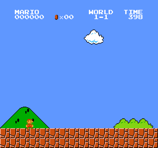
First, note Mario’s peculiar posture; he faces both toward the player with his body and toward his destination with his head. Try mimicking this pose with your own body. Can you remember the last time you stood this way? Of course, this is partly explained by the limitations of tile-based graphics. Mario is built from four 8×8 sprite tiles, so there is only so much expressive quality one can wring from such constraints. But I also think this pose is intentional, both to signal the player that this is their onscreen avatar and to signal their intended movement vector.
The screen’s second notable feature is its palette. The Mushroom Kingdom has a vibrant, cartoon quality that frames Mario’s adventures in a meaningful way. What the blue sky, the distant hillside, the spare billowy cloud, the identically billowy bushes (actually just palette swaps of the clouds) all impart is a sense of expansiveness. This is a world worth running through. And while it may seem silly to think of the NES’s limited graphical quality in this way, remember that most games prior to SMB were set against black backgrounds, ideal for sci-fi shooters or the abstract spaces of games like Pong or Breakout, but also oppressive in their emptiness. The NES palette was well-stocked in blues, so skies like these were possible. And it’s notable that SMB reserved its blacks for diegetically appropriate times and spaces: at night and underground.
Finally, we have an unseen force at play behind Mario. As the player advances forward, she will soon find that she can no longer return to the left once it has scrolled out of view. The technical reason for why this happens is an article in itself, but the short explanation is that SMB’s engine was designed according to a very constrained ROM profile. And since Mario is capable of destroying bricks along his path, allocating RAM to those bricks that had and had not been shattered would have taken too much memory. That’s not the whole story, but it suffices to explain Mario as a largely unidirectional vector (simple checkpoints notwithstanding). You might backtrack briefly, but you’re compelled to continue right.
I like the term vector as a formal descriptor in both its mathematical sense as a directional spatial quantity and in its biological/etymological sense as a ‘carrier,’ i.e., Mario here being the vector of player input, the ‘host’ to our demands, as it were. Formalizing design patterns can help us abstract certain decisions out of particular games and look at general design trends across platforms, genres, developers, etc. To do so, I want to propose a few terms to help encapsulate these patterns so we can compare a number of NES opening screens and how each instructs the player of their goals, mechanics, etc.
Let’s abstract SMB’s opening screen into a more schematic form, as I’ve illustrated below:
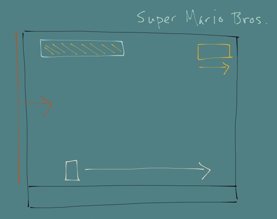
There are four elements working to compel the player forward: Mario (the white box) is the primary carrier vector, the clock (yellow box) is a strong temporal vector, the screen’s left edge (red line) is a weak compulsion vector, and the coin/point counters (upper left box) are weak incentive vectors. The carrier is of course the primary actor since, without the player’s input, Mario goes nowhere. But note how the three other vectors are compulsory to relative degrees (what I call weak or strong), encouraging movement through enticement (accumulate points/lives), technical constraints, or a rigid rule structure (time limit).
Clearly time is the strongest governing vector, since no manner of gameplay finesse or mechanical mastery can circumvent it. If time runs out, Mario dies and movement ceases, full stop. But the temporal vector is also one of the game’s subtlest instructional cues. In Anthropy’s article, commenter Bryce notes that new players often have no idea that the B button makes Mario sprint. And indeed, a later commenter posts a video to prove that one can theoretically play through SMB without it. Consider for a moment how difficult it is to convey the B button’s function through gameplay. Miyamoto’s team conceivably could have constructed a gap too wide to jump without it (which they do in World 8 (not to mention the impossibility of snagging the upper flagpole height minus sprinting)), but doing so early on might have frustrated players grappling with a new genre. There are two other ‘forces’ at work that likely solved the problem: first, that the social conditions surrounding SMB’s release—namely that it was monumentally popular—ensured that word-of-mouth would convey the game’s sprint function (a fact noted in Jeremy Penner’s ‘Breaking the Law of Miyamoto’); and second, that the NES controller’s simple design would compel players to experiment with various button combinations. In other words, one can quickly cycle through all possible inputs in a few seconds. Whether by luck or by schoolyard, the B button’s function would disseminate.
But I think the temporal vector is an effective nudge for player experimentation. It’s certainly possible to walk through 1-1 at normal speed with plenty of time to spare, even with a few detours for coin collection. But sprinting can effectively subvert the clock, transforming it from a temporal threat into part of the game’s incentive structure, i.e., if Mario runs faster, he gets more points at the end of the level.
I call the left boundary and incentive vectors ‘weak’ because they do not actively compel Mario’s movement. Instead, they are reinforcements for carrier agency. Later Mario games would implement auto-scrolling levels, changing the leftmost barrier into a strong threat vector, but for now it is a benign constraint. Likewise for coins and points, which have no inherent value in the game’s narrative structure. One can certainly rescue the princess without breaking the high score or amassing extra lives. I am also hesitant to label incentives as vectors, since their directional structure is ambiguous. Mario of course cannot collect coins without moving forward, but it is also arguable that incentives are equally as ‘vertical’ as they are ‘horizontal.’ In other words, incentives compel the player to jump as much as they compel her to move right.
In the spirit of (relative) brevity, I’ll conclude Part I here in hopes that this lays the foundation for some further thinking about vector types and forces in game design. In Part II, I’ll talk about other inspirations for this formal vocabulary and walk through a number of other influential NES opening screens.