Spatial Vectors in Videogame Design: Part II
In Part I, I introduced the concept of spatial vectors as they apply to the opening screen of Super Mario Bros. (If you haven’t done so, read that article first, or little of the following will make sense.) Before reviewing other NES examples, let’s take a look at the original inspiration for the vector concept.
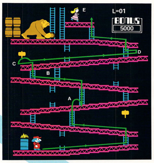
The image above is from Joystick, an innovative but short-lived magazine that, as far as I can tell, ran ten issues between September 1982 and December 1983. Their subtitle was, ‘How to Win at Home, Computer, & Arcade Games,’ so they featured a lot of strategy guides for the hits of the era, such as Berzerk, Pac-Man, Asteroids, Pitfall, Yar’s Revenge, and, of course, Donkey Kong. Archives of Joystick are available online, and I’d recommend hunting them down—the graphic design alone is worth your time. Joystick’s designers absolutely fetishized the CRT monitor; meaty scanlines, exaggerated pixels, and extreme phosphor blooms abound.
The Donkey Kong illustration is representative of Joystick’s strategy write-ups. In addition to text descriptions and screenshots, they’d feature ‘patterns’ that mapped the best routes through a game’s levels. In the era when most games were single-screen, this made a lot of sense—players needed to know how to traverse the space more than they needed maps. In other words, Pac-Man’s screen arrangement was static, but Pac-Man certainly wasn’t. The strategy was in the patterns. Compare this to the coverage perfected by Nintendo Power in the age of console platformers, where stitched screens became the predominant mode of spatial mapping. There the characters were typically erased from the screen; panoptic views of space (and its hidden secrets) were the norm.
Here Joystick has plotted Jumpman’s optimum path in the opening ‘girders’ level, annotating key stops with capital letters: take the ladder at ‘A’, grab the hammer at ‘C’, and so on. Besides being a beautiful illustration in its own right, Joystick’s patterns got me thinking a lot about how players are compelled to move through space and how the game teaches them to do so. In other words, how do these patterns map to other videogames?
Since we are already looking at Donkey Kong, let’s break down its opening gameplay screen, this time using the NES version:
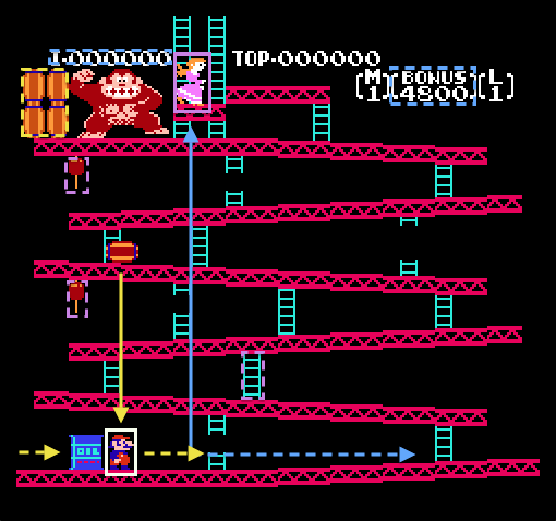
As in Super Mario Bros., Jumpman/Mario is the primary carrier vector, though note that he is viewed in proper profile, rather than the strange neck-twisted pose he strikes in the later game. And unlike Mario, Jumpman’s immediate vector is deferred—the ultimate goal is the top of the girder structure (blue arrow), but he must make a series of lateral moves (blue dotted line) to reach that goal. For new players, two important beacons convey this information: Pauline, who perches atop the penultimate girder, and the thirteen ladders presumably keeping the girders suspended above the void. Note how these are among the lightest elements on the screen. Pauline is the only sprite garbed in bright pink and the ladders are a peculiar aquamarine. Beacons are meant to signal the players movement, and palette choice is one of the primary means to do so. Also note that the suspended hammers are weak beacons painted with a harder-to-discern brown/light brown palette. The hammers give Jumpman a limited invincibility, but they also momentarily negate the goal vector by stealing his jump ability. And considering jump is part of his name, that’s a pretty significant tradeoff.
In the event that these beacons fail, several threat vectors get Jumpman moving. The strongest of these is the barrel Donkey Kong drops immediately after the opening fanfare plays. The lesson is decisive: move right or die. The second threat vector teaches the player vertical movement—if Jumpman lingers too long on the first girder, a firefox emerges from the oil barrel and pushes him (hopefully) up the first ladder. And note the cunning design trick to Jumpman’s immediate right: the first ladder is broken, so the player must traverse the entire bottom girder before they can continue upward. It’s a devious but important lesson.
At this point, the remaining threat vectors have not deployed. I’ve noted this by boxing the barrel stack in a dotted yellow line. The brilliant part of Donkey Kong’s design (and single-screen arcade games in general) is the ability to mobilize threat vectors dynamically. Barrels spawn at regular intervals during Jumpman’s ascent, and semi-random algorithms dictate whether they’ll slide down a ladder or fall off a girder’s edge. The cascade of barrels combined with the player’s chosen path creates an oscillating rhythm of give-and-take where Jumpman must move laterally, backtrack, climb ladders, and jump to reach his goal.
In the upper right blue box, there is a strong temporal vector in the guise of a BONUS counter, which ticks down the bonus score to 0 (causing both the bonus and Jumpman to expire). As in Super Mario Bros., quicker times result in higher bonus scores, but here the design foregrounds the incentive rather than the threat.
Finally, there is a weak incentive vector in the form of a score counter. Its presence illustrates the way an incentive vector can shift from weak to strong depending on the player’s relationship with the game. Beginner players likely don’t care about their score—their goal is survival first, the completion of the three-screen ‘narrative’ second, and score last. Master players reverse the incentive structure since they’ve absorbed the game’s objectives and mechanics. Survival becomes a function of score accumulation.
Clearly, even in ‘simple’ one-screen games like Donkey Kong, there are multiple competing vectors at work. In Part III, I’ll take a look at several more (scrolling) NES games and how they built on the design lessons of their forbears.