Spatial Vectors in Videogame Design: Part III
If you haven’t already, please see Part I and Part II of this series.
Now that we’ve established a formal vocabulary, let’s take a look at a series of Famicom/NES games that present interesting variations of the patterns seen in Super Mario Bros. and Donkey Kong. I’ve arranged these chronologically by their Japanese release date to show how quickly conventions changed between 1985 and 1990. Each game has an annotated image, a summary of those annotations, and any additional notes.
Dragon Quest / Dragon Warrior
Genre: RPG
Release Date: Dec. ’85 (FC) / Aug. ’89 (NES)
Carrier: Center screen, facing up
Carrier vector(s): Deferred
Beacon(s): King (strong), staircase (deferred), chests (weak)
Threat vector(s): None
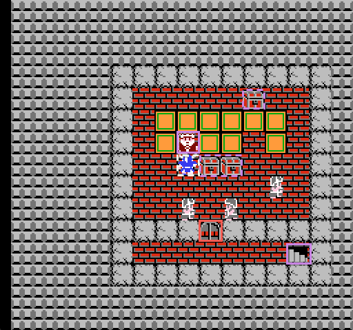
Dragon Quest is one of the first Japanese RPGs. It molded the genre’s conventions and established many of the ‘rules’ for RPG game design. DQ’s opening screen is peculiar compared to our prior platforming examples precisely because the carrier is not permitted to move until the king delivers his opening monologue. There is no button prompt—the king simply initiates his speech after the player presses any button. Once he concludes, the player is free to explore the room.
The obvious beacon is the stairwell in the lower right, but this is blocked by the door. This actually serves as a brilliant little tutorial for the game’s menu system, since the player must scavenge the chests for a key, some gold (for supplies), and a torch (for dungeoneering). Optionally, if the player talks to the guards, the game’s subquest (rescue the princess) is revealed.
The opening throne room also serves as a microcosm of the first screen the player sees after exiting the castle:
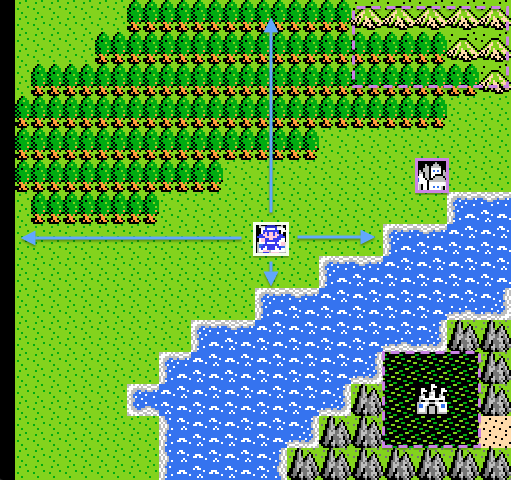
This is the player’s introduction to ‘walkabout mode,’ wherein they are free to explore the larger world. Though the carrier remains the same size, the world ‘shrinks’ into an abstracted overworld map view. What’s remarkable is that the game’s designers reveal the game’s final area—the castle to the lower right—at the beginning of the game. It is, of course, completely inaccessible without circling the entire map, but the predominantly white sprite pops against the surrounding swamplands and that single tile of desert similarly draws the player’s eye.
The more immediate beacon is the town directly northeast, while a weaker beacon lies in the mountains further on. But from his position at center screen, the carrier is free to travel in any cardinal direction. It’s smart aspirational design: the end is spatially near, but temporally distant.
The Legend of Zelda
Genre: Adventure
Release Date: Feb. ’86 (FDS) / July ’87 (NES)
Carrier: Near center, facing up
Carrier vector(s): Up, left, right
Beacon(s): Cave entrance
Threat vector(s): None
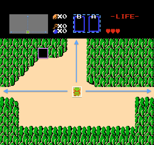
I’ve talked at length about Zelda’s opening screen, but a few other notes are worth mentioning.
First, the structure of the green cliffs and the carrier’s starting position subtly funnel the player north. Note how the northern passage is two Links wide, while the narrower paths on either side are merely one. Funneling the carrier vector upward will also pass by the strong beacon on the upper left. The empty void puncturing the cliff face screams for attention and rightly so—venturing forward without the sword is not recommended for beginners. It is, after all, dangerous to go alone.
Second, the vector structure is mirrored and expanded in the minimap seen at the upper left side of the status bar. The small green dot is a subtle link to the carrier’s position that the player will hopefully recognize along with their current screen’s position within the larger world.
Finally, the empty boxes labeled ‘B’ and ‘A’ (to match the controller’s configuration) serve as weak signals that there are items to be found. Following the first beacon reveals how the system works—Link’s sword occupies one slot, so there must be other similar items to find. If the designers simply provided the sword from the outset, this lesson would be lost.
Metroid
Genre: Adventure
Release Date: Aug. ’86 (FDS) / Aug. ’87 (NES)
Carrier: Lower center, facing player
Carrier vector(s): Left (strong), right (weak)
Beacon(s): None
Threat vector(s): Down (strong), left (weak)
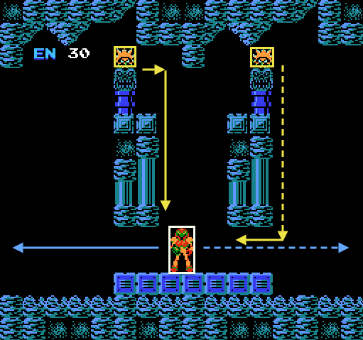
Less than a year after Super Mario Bros., Metroid was already breaking side-scrolling conventions. Jeremy Parish has written about Metroid’s opening screen in his Anatomy of Metroid series, and he notes that the player’s first impulse is to move right. Indeed, the carrier’s opening position is ambivalent—Samus directly faces the player as if to say, ‘You decide.’
Meanwhile, I’d argue that a series of subtle clues are actually guiding the player left, despite what Mario might have taught her. While Samus does straddle the exact horizontal center, note how she is positioned relative to the platform and the floating architecture above. She stands slightly left of center, placing her in the direct path of the game’s first threat vector, carried by the spiny foe that crawls clockwise around the blue hanging column.
The trick here is that remaining motionless allows the enemy to pass by Samus harmlessly, since their hitboxes do not overlap. But for new players, the impetus is to move out of the way. However, pushing right risks a collision with the rightmost enemy. In fact, the shapes of the floating columns time the movements of the enemies so that just as the leftmost creature is descending to Samus’ position, the rightmost enemy is rounding its column’s lower right edge. The path right is more treacherous, but left provides an easy escape. And as soon as the player heads in that direction, a new structure scrolls into view, signaling that Samus’ path can branch either way.
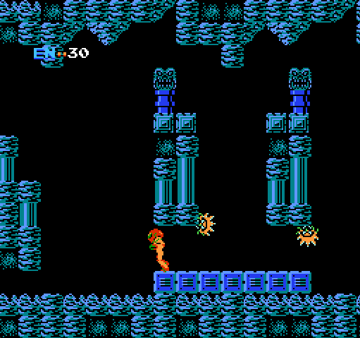
With the lack of any beacons, the designers chose to let the simple interplay of enemy paths and architectural structure guide the player against convention. It’s masterful design work.
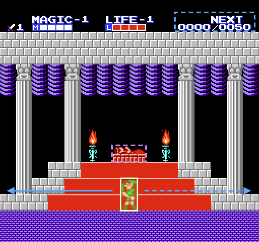
Zelda II: The Adventure of Link
Genre: Adventure
Release Date: Jan. ’87 (FDS) / Dec. ’88 (NES)
Carrier: Center, facing left
Carrier vector(s): left (strong), right (weak)
Beacon(s): Princess Zelda (weak)
Threat vector(s): None
Zelda II’s opening screen absorbs the lessons of its predecessor while picking up cues from Dragon Quest and Metroid. Zelda, held in magical slumber atop a three-tiered pedestal, serves as the deferred beacon. Link begins in front of his ultimate goal (which we see repeated in Shadow of the Colossus), but hours of adventuring await him before he can return. Link also faces left, compelling the player to, once again, push against convention, though this time without any architectural or combatant cues. Zelda’s resting place is perfectly symmetrical, so only Link’s body compels the player toward a specific direction.
Finally, there is a weak signal in the upper right corner, where ‘NEXT’ designates the game’s leveling mechanic. This text, combined with a numeric counter and the 1’s labeling the sword icon and LIFE/MAGIC bars, tells the player that progression is possible.
In Part IV, I’ll conclude the series with a look at four more NES titles.