Major League Baseball vs. Retro Criticism
Via Twitter, friend of the site Cameron Kunzelman recently introduced me to Eric Bailey, proprietor of Nintendo Legend, a site dedicated to reviewing every North American NES release. I am often pinged for NES-related sites like this, and there is certainly no lack of them online. The ‘retro review’ has become an active critical subgenre, primarily adopting the modern model of videogame reviews (a la Kotaku, Joystiq, GameInformer, et al.) and applying them to vintage games. Sites like Nintendo Legend adopt a gimmick, like exhaustive cataloguing, to further distinguish themselves from their peers. I’m into this kind of thing, and I love seeing fresh takes on old games, filtered through the sieve of thirty-plus years of industry change.
What I don’t like is how most of these sites tend to skew along two extreme (and often simultaneous) lines: panting praise of retro games as emblems of some bygone era of ‘pure’ design or postured ‘angry’ critiques that revel in adolescent name calling and scatological humor. While sometimes entertaining, neither count as useful criticism. Yes, select retro games are timeless, most are forgettable, and many are shit. But we learn little from hagiography and less so from mean-spirited mockery. So why review old games at all?
From what I’ve read, Eric’s site doesn’t seem to veer too far toward either pole, but one review—1988 licensed sports title Major League Baseball—jumped out at me because it was both a favorite of mine as a child and a game often overlooked by retro review sites. Eric’s feelings toward the game are clear: ‘It sucks. It is a bad game.’ In his condensed review, he highlights the tedious roster selection, some odd glitches, and the game’s overall sluggish pace. In his full review at examiner.com, he elaborates on these points and piles on more: the colors are gaudy, score blowouts are common, the physics are wonky, and so on. These are fair points, though many boil down to questions of taste—I, for one, was fascinated with the roster selection as a statistics-obsessed youngster, and the lack of player names didn’t bother me because the numbers still matched the stats. To each their own.
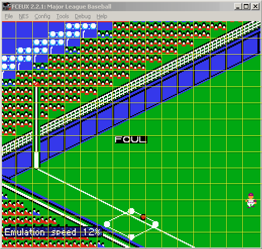
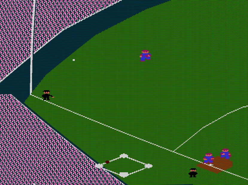
What piqued my critical eye in Eric’s reviews was his attention to a few quirky elements, some mentioned in captions from the many provided screenshots (a strength of Eric’s site, I think). For example, below one image he writes, ‘Why did they even bother drawing people in the stands? It’s like they gave the most minimal effort possible. Check out the random handful of different-colored fans in the upper-left corner. What’s up with that?!’ I remember wondering the same thing as a child, since the odd blue-clad fans punctuating a sea of redshirts does seem arbitrary. But the answer to why isn’t a matter of designer whim—it’s a technical limitation.
The NES’s Picture Processing Unit (PPU) distinguishes two types of tiles: background tiles and sprites. As described, the former form the backdrop of most games, a strictly-gridded mosaic floor upon which the more mobile sprites may dance. The NES provides four palettes apiece for each tile type. Each palette is like a box of crayons with four colors in it, albeit with one crayon that must be the same across all palettes. This single shared color allows transparency to happen, so sprites don’t end up looking like stamps moving across a checkerboard.
Each individual sprite may select its own box of crayons from the available four. But background tiles don’t have the same luxury. To save memory (and thus money), Nintendo opted to limit background tile palette selection to one box of crayons per 2×2 tile ‘chunk,’ or the size of a [?] block in Super Mario Bros. This restriction required significant planning to design around, because it created a separate visual ‘grid’ (called an attribute table) atop the PPU’s background tile structure. Most NES games are built around these 2×2 chunks in order to prevent weird ‘attribute clashes’ between color seams.
In the screenshot below, I’ve drawn a reasonably-accurate attribute grid above MLB’s playing field so we can see how the colors divide. The crowd graphics rise on a stair step because of the underlying grid structure, but you’ll notice that the blue shirts (near the upper left) appear in chunks where crowd and sky must coexist in a shared 2-tile-by-2-tile area.
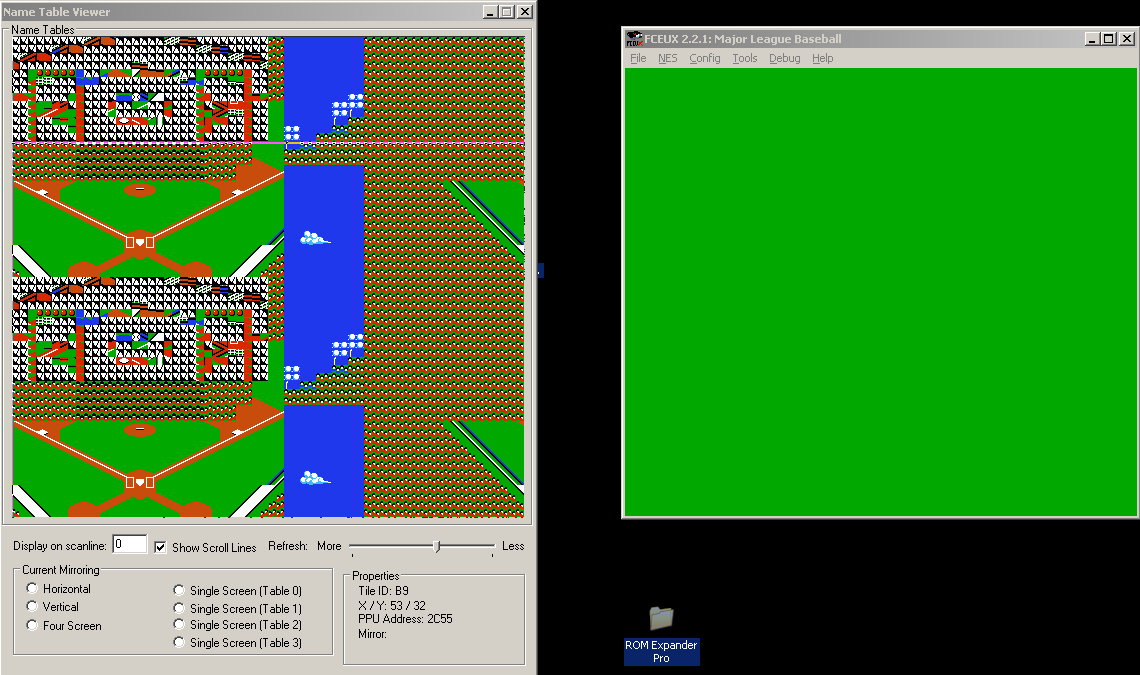
Below I’ve captured the PPU Viewer from the NES emulator FCEUX so we can also see the selection of palettes available during MLB’s fielding segments.
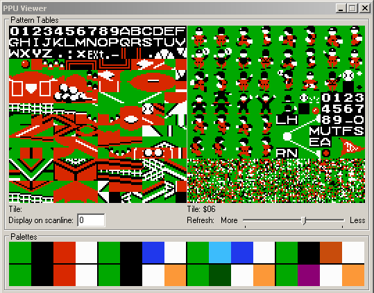
The top sixteen colors comprise the background palettes. First note the green color that leads each group of the four—this is the game’s shared color (clearly a wise choice for a baseball game populated primarily by grassy field). The first group of four colors is the primary crowd palette; the next four paint the blue shirts but also the patch of sky above them. So to answer Eric’s criticism: MLB developer Atlus (yes, that one) actually made a careful creative decision when they painted the crowd blue; better a few blue shirts than a nonsensical patch of red sky.
How did other developers tackle this creative constraint? Most opted for what I call ‘crowd confetti,’ masses of (up to four-) colored dots meant to imply individual fans rather than represent them realistically. Baseball, Bases Loaded, R.B.I. Baseball, Baseball Simulator 1.000, and Roger Clemens’ MVP Baseball all use this approach, as we can see below (note that the faux curvature and scanlines are simply a setting on my emulator):
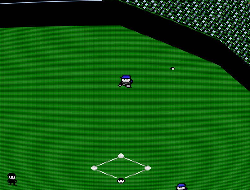
Notice that our confetti artists cover a wide range of NES history, so it’s not just that Atlus took the easy route; their effort to articulate actual people in the audience is commendable considering their limited resources.
Eric also comments on another in-game quirk, an ‘annoying brief pause after batting contact,’ to which he adds, ‘seriously, does any other 8-bit baseball game have a freaking freeze, albeit brief, every single time you hit the ball?!’ I can’t speak for other 8-bit consoles, but for the NES, the answer is yes, they all freaking freeze. And again, understanding the platform tells us why.
In NES programming, there is a very slim margin of time wherein game animation may take place. This vertical blank, or VBLANK, is the amount of time it takes for the television’s electron scanning gun to reset from the bottom of the screen to the top. For a sliver of 1/60th of a second when the gun isn’t busy painting the screen, programmers can make tile adjustments, working hastily to prepare the playfield before the gun recommences its busywork. The catch is, the NES doesn’t have the processing power to update every tile onscreen in a single VBLANK.
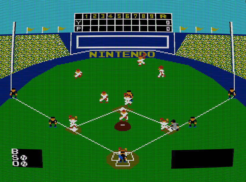
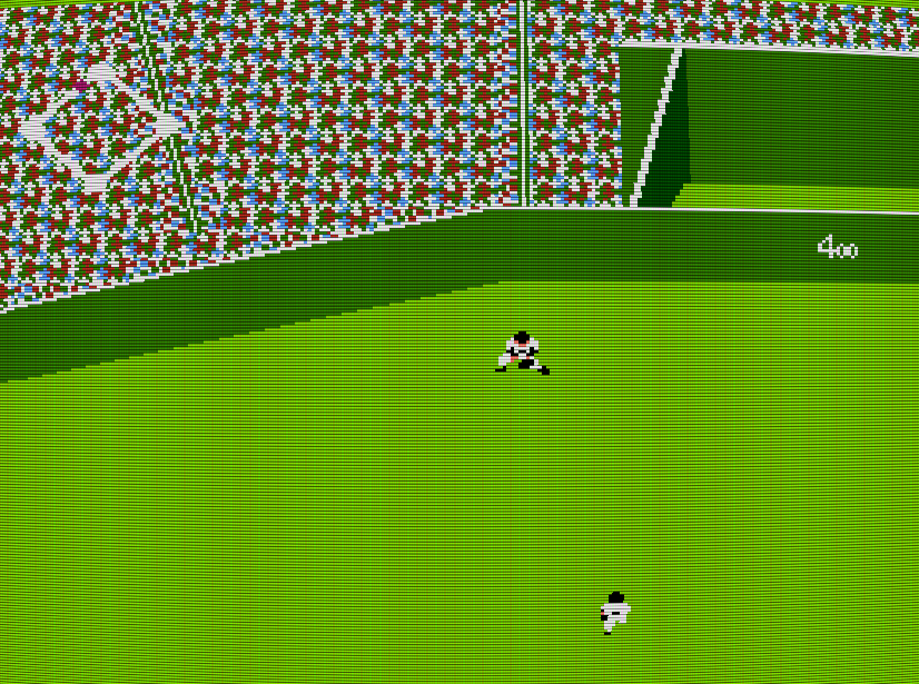
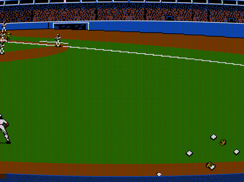
Fortunately, most games don’t require this kind of large-scale, all-at-once readjustment. Scrolling, for instance, handles updates in column- or row-size chunks. But in MLB, as in many other baseball videogames, there are abrupt transitions between perspectives, usually mimicking the angles seen in televised sporting events. In other words, when a hit happens in MLB, the camera switches from the tight, behind-the-plate perspective to a zoomed, ‘macro’ view more appropriate for fielding. Doing so takes extra processing time—specifically, a few additional frames when the PPU stops drawing in order to shift the second view’s constituent tiles into place. In the screenshot below, you can see this process happening on the fly. The screen to the left shows the contents of the NES’s video RAM during the ‘freaking freeze.’ If you’re familiar with the game, you can see that it’s currently halfway between batting view and fielding view. (And, at a more technical level, the game is also bank switching a new page of tiles into CHR-RAM, a process that also requires more time.)
The reason this shift is so evident in MLB is because of—wait for it—the shared palette color. When drawing is disabled for a few frames, the screen floods with background green. Every other baseball game I checked defaulted to black, which has a much subtler effect. A few frames of black make more sense to our eyes because they feel like a quick fade-out/fade-in effect. But a screen full of garish green sticks out like a sore thumb. It may have been a poor color choice on Atlus’ part, but it wasn’t a programming failure.
I don’t mean to pick on Nintendo Legend or any other retro-oriented site. These games need attention beyond their original ‘generation,’ even those that show their age through bad graphics, clunky mechanics, or spotty physics. But criticism as a transformative process, especially for older work, demands patience and sincerity toward the object itself. Part of being true to a work is understanding not only its context vis-a-vis other games, but also its technical, economic, political, and cultural contexts.
Unless you subscribe to game criticism as buying advice, the most important questions are never ‘Does this game suck?’ or ‘Is it fun to play today?’ Instead, we might ask what limitations the developers faced and how they chose to work around them. Did they opt for simple solutions or find creative workarounds? What can those solutions teach us about game design? About game economics? About cultural considerations? (Note that the super-deformed ‘chibi’ style characters in MLB mark it as a Japanese-developed game, despite it’s American license.) And part of our responsibility as critics, whether for new or old games, is to do the difficult work of uncovering a game’s obscure layers, whether in code, or box artwork, or silicon, or errata in manuals. Or, to use Eric’s own words, ‘when I examine this cartridge closely, I am further convicted of my opinion that a lot can be concluded about a video game from looking at its nitty-gritty details.’